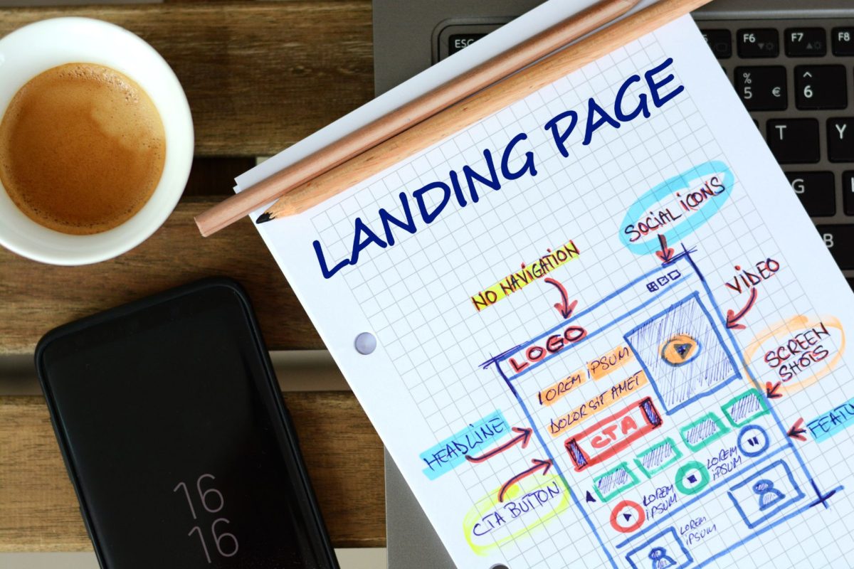
This guide breaks down how to create a landing page that converts, guiding you through the process of selecting the right tools, crafting compelling content, designing with impact, and testing to ensure peak conversion rates.
Logos are characteristic elements of every brand’s visual identification. You see them everywhere on a daily basis – on products, leaflets, buildings and in advertisements. They’ve become a part of our everyday life. Many people can recognize multiple brands just by looking at their logo. Some companies use one logo for many years, while others update theirs regularly. Why do brands change or modify their trademarks? How did well-known brands change their logos and where will the evolution of logo take us in the future?
Why do brands update or create new logos?
It’s important to adapt to the ever-evolving market. Many firms remake their logos every few years. Their mission changes with them. An old logo might not properly convey the company’s message, which should be kept up-to-date and easy to understand for every person from the target audience.
Graphic and web design trends change from time to time as well. After some time different colors, patterns or symbols might no longer be in style, while others will become popular. Firms that want to grow must keep up with the expanding market. Older logos must be updated, when they no longer attract the potential customers’ attention. Minor changes in the layout, background or font style and color are usually enough to refresh a logo.
Brand logo – evolution of famous firms
Brand logo transformation usually revolves around simplicity. This is especially the case when it comes to the older firms that were established in the nineteenth century. Their logos changed from complicated and graphically complex to simpler and more legible ones. We can see this trend everywhere as many IT companies, car brands and well-known fast-food chains were developing their respective logos over time.
Logo transformation of well-known IT companies
Computers and software are something that we cannot live without. They are an irreplaceable asset of every company. However, both of those things are relatively new. Computers, in the form we know them today, are a quite recent invention. The companies that made them or developed software didn’t have any special way of introducing themselves on the market as their products were not available to everyone. They functioned mostly on the B2B model. IT firms had a cold and toned-down image and their main message was professionalism. The first company to break this trend was Apple, which introduced the very first personal computer.
From that moment, IT companies tried to come across as “user-friendly”. Everyone knows what the Apple or Microsoft logos look like today, but surely not everyone remembers what they looked like in the past and how they evolved.
Here are some of the logo evolution examples presented based on companies that have changed their logo.
IBM
IBM’s logo is one of the most famous and recognizable in the world. This company, just like its logo, went through many changes. At first, this firm was called International Time Recording Company and had a simple logo consisting of three letters (ITR). It was changed for the first time three years after the funding of the company.
The changed logo had a complex graphic design and a shape that was difficult to define. The next update took place ten years later, after the merger with Computing-Tabulating-Recording Company – the new design was legible and the letter “C” was added. In 1924 the company management decided to change the name to IBM and a brand-new logo had to be made – the company name was forming a circle with a ring.
IBM changed their logo again in 1947 and it looked almost as the one it’s using today. From that point, the logo changes were small and rather cosmetic to simply refresh the brand. The logo was well-received by the customers and no significant changes were made ever since. It embraces minimalism and simplicity while discarding any unnecessary details.
Microsoft
Microsoft entered the computer market in the 1970s. Their first logo consisted of two parts of the company name, “Micro” and “Soft”, written in different shades of gray. It was simplified the same year. The new design featured a blibbet – the letter “o” formed with horizontal lines instead of a circle. That logo survived for thirteen years before it was changed by Scott Baker. He removed the blibbet, which started the “Save the Blibbet” campaign, introduced italics and a more expressive font with a small indentation that is still used today. The last logo was introduced in 2008. The owners of Microsoft also strove for simplicity from the very beginning.
Apple
There are very few people who would not recognize this logo and the company behind it. Even those who don’t use Apple products know something about them. The current logo is the perfect example of an eye-catching and easy-to-remember sign. In the past, however, Apple’s logo looked very different.
The idea was good, but the design was illegible. The first logo presented Isaac Newton sitting under an apple tree that had one ripe fruit. It was quickly changed – everything, except that one apple, was removed. The outline of the apple was filled with the colors of the rainbow. That logo had to be changed again when the iMac entered the market. A new, black design was introduced mainly because the rainbow logo did not look slick on modern laptops. Later on, the color was changed to light silver, which made the logo both fun and professional.
Car brands and the evolution of their logos
Car brands’ logos are very clean and easy to remember, which makes distinguishing them simple. Each manufacturer has their individual style that is reflected in their respective logo. Small adjustments in the logo design refresh the brand’s image and make it more engaging – why should they remain the same when cars change with every model?
The most recognized trademarks belong to brands such as Mercedes, Audi, Peugeot, Volkswagen, BMW and Renault. Their logos haven’t undergone any drastic changes, only small modifications were implemented.
In our previous article, we examined the symbolism of logo shapes. The iconic BMW logo serves as an outstanding example. Through its circular shape, the logo represents a wheel, reflecting the company’s association with mobility and automotive excellence. Over time, the BMW logo has evolved while retaining its circular form, reinforcing its brand identity and legacy.
When comparing old logos vs new logos the difference is especially visible in those owned by Volkswagen. One of the brands that have barely changed anything in their logo is Aston Martin, which has had basically the same logo since 1932. They managed to create a modern design that is in use to this day. Mazda, however, has a completely different approach to their trademark, which changes drastically every decade. At first, it was simply the brand’s name. Later on, the manufacturer switched to a confusing logo that consisted of three bent lines. During the 1990’s Mazda’s logo changed every four to five years. Some brands keep things simple, while others go a little crazy. It’s worth mentioning that in 1919 Renault had a tank in their logo, Cadillac had swans and Alfa Romeo had a dragon.
As we explore the fascinating evolution of logos throughout history, it’s worth revisiting our previous article on logo redesign.
Logo evolution future
How will the logos change in the future? Logo progression can be predicted based on the current trends. Nowadays, there is a tendency to create logos that are simple and legible. We must also consider the development of technology. The logo must look good: on a larger and smaller screen, on a billboard, on doors and on products. It has to look good everywhere it’s placed.
How to modify a logo?
It’s best to let the professionals do the logo design for you. Nopio can assist you in the process of creation and modernization of your logo. The best examples of our company’s work are the changes implemented for the Genea brand, which were necessary due to the merger of the corporate image with the SaaS startup. Click here to go through the final product!
Another example is the logo change for the Center for Couples and Sex Therapy, which required an update due to the rapid development of the company. You look through it on this site.
As we explore the fascinating evolution of logos throughout time, it becomes clear how strategic branding decisions can shape a company’s image. If you’re looking to navigate your own logo transformation, our professional branding services can help you create a memorable and impactful identity.
We also encourage you to read the article on marketing company logo design.


