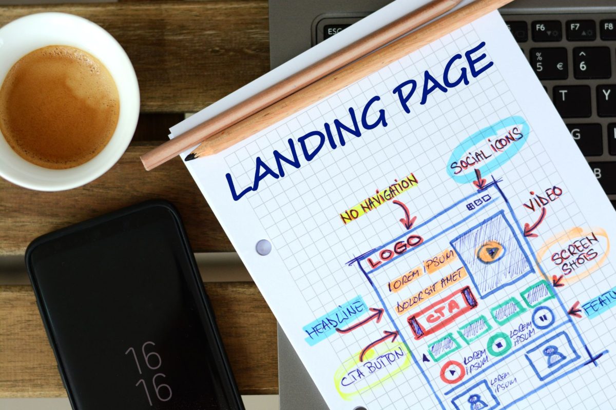
This guide breaks down how to create a landing page that converts, guiding you through the process of selecting the right tools, crafting compelling content, designing with impact, and testing to ensure peak conversion rates.
Marketing is among the most important industries because every existing company needs it. What exactly is marketing? It is a series of activities that aim at informing recipients about the brand’s existence and attracting them to the business as well as its products or services. Companies that take care of marketing for other enterprises often forget that they also have to do it for themselves. What is more, they need well-conducted branding, including a properly designed logo. So what should be the ideal marketing company logo like?
Creating a brand image in the marketing industry
The name, slogans, or custom logo are the elements that are supposed to evoke certain associations among recipients as well as evoke positive thoughts and impressions. All of this directly affects how clients view your products and services.
In the case of a marketing company, its own image and marketing activities allow potential customers to determine if it is capable of creating a marketing strategy for them. The agency’s logo is one of the most important elements of its brand image. It is visible everywhere, and it is the first thing that the potential clients notice.
A good marketing logo should be memorable, evoke positive feelings and make customers pay attention to the business. So what should the proper logo for marketing company look like?
Common features of marketing logos
What do the marketing firm logo and other businesses’ logos have in common?
Each company has its own unique logo, but the logo designs of all brands share certain characteristics, such as:
- standing out – an original logo design catches the eye the most and is easier to remember. As a result, the brand itself also becomes unique, which allows you to stand out from your competitors;
- bold design – whatever the element (main symbol, typography, icon, graphics or abstract images), the bold design project characterizes all the best digital marketing logos;
- simplicity – there is no need to overcomplicate things. One of the contemporary trends in logo design is minimalism. When looking for inspiration for a marketing logo, a simple style is a great choice. The fewer design elements and details, the easier it is to remember the logo.
A responsive, adaptable and conceptual logo
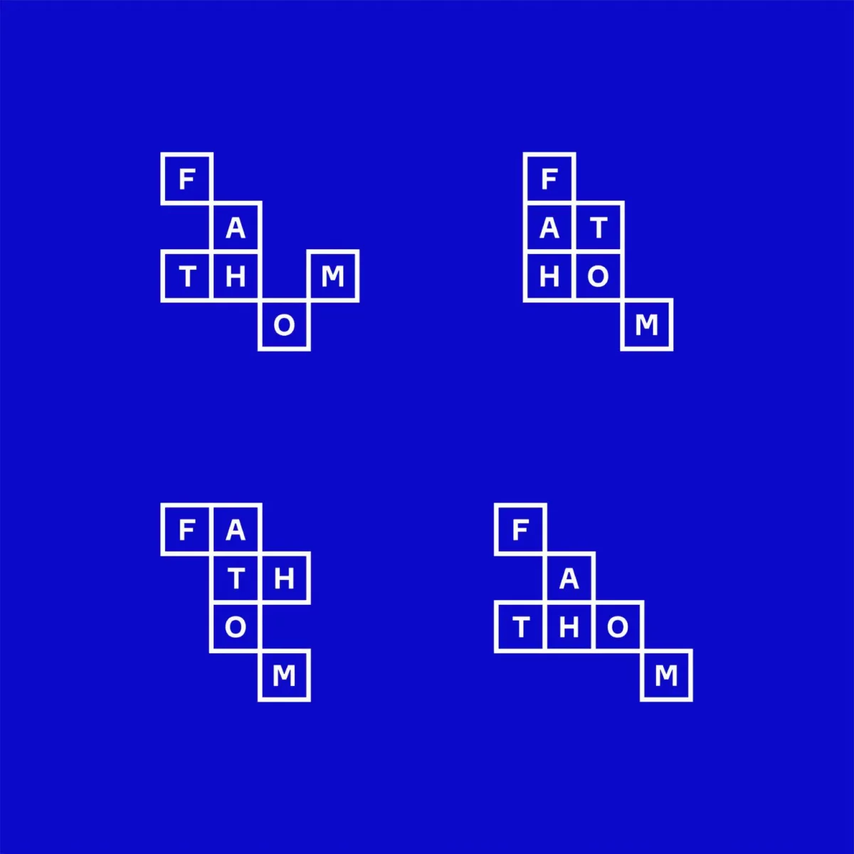
A modern logo for digital marketing company should above all be responsive. It has to look perfect everywhere you place it – especially on a website or social media marketing channels. A marketing agency must understand the importance of having a good and custom logo.
An advertising agency logo must look perfect in every size. You should not have any problems with adjusting it to any background. It has to look good in both light and dark modes. In addition, it must also fit perfectly to the layout on the website. All variations of your logo should be included in a brand style guide.
The logo serves as the cornerstone of your marketing company’s brand identity, and our custom website design services excel in harmoniously blending it into the website layout for a polished and impactful online representation.
Using a literal logo is also an option. It is a symbol that depicts what the agency does. In some cases conceptual logos can be perceived as literal ones, which can lead to huge misunderstandings. For example, the Apple company has an apple in its logo, and yet it does not grow nor sell apples.
There are many literal marketing logos on the market. However, you need to remember that the new logo design should primarily distinguish the agency, surprise recipients and attract their attention. Therefore, it should be original, but not necessarily literal.
When striving for a perfect marketing company logo, it’s worthwhile to draw inspiration from the article on logo for startup, as it provides practical tips.
Marketing company logo – typography
If you are going to put your marketing agency name in the logo or add a tagline, then you have to choose the right typography. It is best to be consistent and limit the variety of text styles used in various marketing tools, such as brochures, flyers, advertisements, websites, as well as any trademarks and logos.
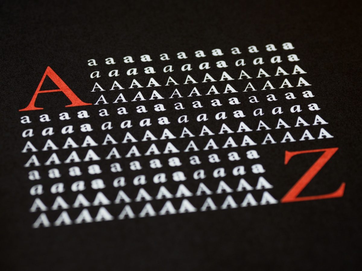
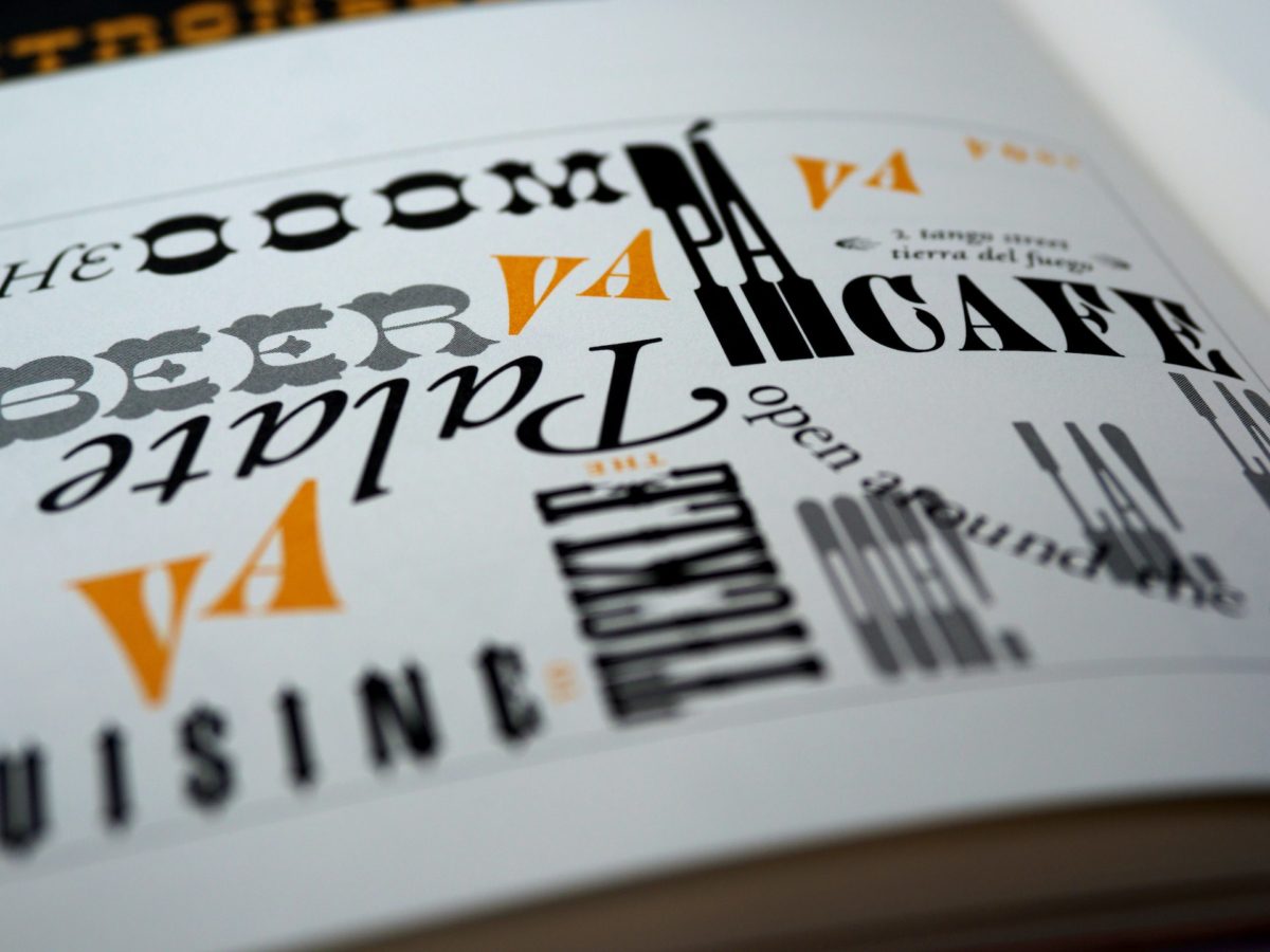
The most commonly used typefaces for a marketing services logo are Serif and Sans Serif. The former is short and decorative, with embellishments at the beginning or end of the letters. The latter is simpler and does not have any ornaments. If you want to project a traditional tone, it is better to use the Serif typography, and if you want the marketing materials to appear simple or informal, Sans Serif is a better choice. We’ve already covered common types of fonts, so it’s time to move on to colors.
Colors in marketing logo design spark emotions
The meaning of the colors in the logo for marketing agency is just as important as the font. Be bold and use color schemes to complement the brand personality. Colors represent different emotions and convey separate messages. Here are the examples of the most important colors and their meanings:
- red – passion, love, vitality, and energy;
- blue – stands for peace and the necessary knowledge;
- green – indicates that the marketing agency has a sense of success, development, money, growth, or healing;
- white – brings connotation of perfection, quality or purity;
- orange – is creativity, liveliness, and energy;
- yellow – means youth, brightness, intellect, and joy;
- purple – stands for wisdom, royalty, and imagination.
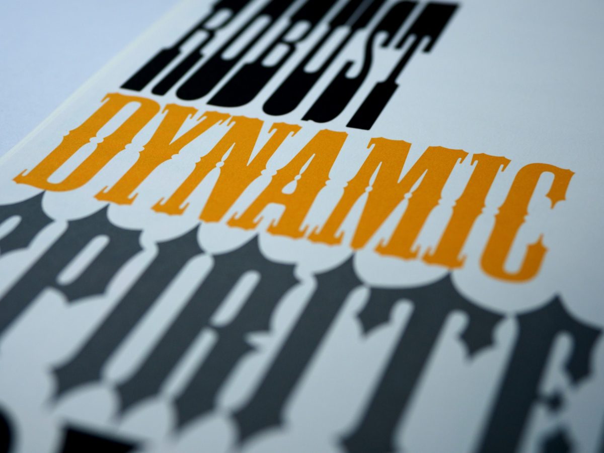
Do you want to communicate that you strive for success and a leading position in your industry? Choose green and purple. Do you want to show calmness and composure? Go for white! Use orange if your marketing agency is energetic. Combination of colors depends on what emotions and associations you want to evoke in your audience.
However, at the beginning, do not pay much attention to color choices. It is better to start designing with black and white. Thanks to this, you will focus on the very concept and structure of the logo.
When you are looking for logo ideas for digital marketing company you should also consider having a monochrome logo, i.e., in one color. Such a logo design is universal and can be even put as a watermark in print.
If you plan to include more than one color, make sure to use contrast but adjust its level. Keep in mind that the logo design must not be too glaring.
A marketing agency logo – summary
Creating a good logo for marketing company is not an easy task. Even a simple concept can have some intricacies that might make the design process harder. When creating a corporate marketing logo you have to pay attention to many factors. Remember that the better you analyze the brand and questions from the customer, the more appealing the final product will be.
Ready to redesign your logo? Do not forget about the most important features a good logo design should have. Keep the project simple, avoid literalness, choose logo colors and fonts carefully, but most importantly, play with the message you want to convey.
Do you want to find out more about logos? Are you looking for additional marketing agency logo inspiration? Get to know the features of a good logo described in the article on the Nopio blog.
If you want and feel up to it, you can try to design your own marketing business logo or use a free logo maker. However, it is worth using the creative services of a professional designer who have the necessary knowledge and skills. If you are searching for a specialist who can design a marketing brand identity as well as a logo, Nopio will be happy to help you succeed. We offer comprehensive logo design services. Thanks to us, you will gain a professional graphic symbol that will make your marketing agency recognizable everywhere.
