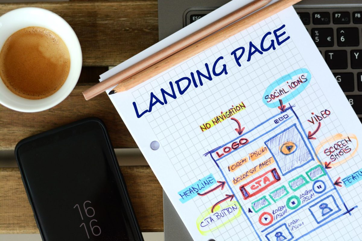
This guide breaks down how to create a landing page that converts, guiding you through the process of selecting the right tools, crafting compelling content, designing with impact, and testing to ensure peak conversion rates.
Until recently, bright colors, flashy graphics and intricate slogans reigned supreme in the world of advertising and marketing. Currently, such solutions are being abandoned in favor of elegant simplicity. In the era of e-commerce, users and contractors appreciate a direct message and a clear vision.
What does minimalistic mean in website design?
What is minimalist web design? It is the lack of unnecessary ornaments, now associated with self-confidence and determination – features that are highly appreciated by entrepreneurs. Therefore, it is worth investing in a minimalist business website.
Minimalist typography
In addition to the substantive values, you should take care of your website’s appearance. It is worth considering the basic rules of typography, a technique that ensures the legibility, reliability and aesthetics of the written word. This art has been cultivated in various forms for thousands of years.
Nowadays, as a consequence of the digitization of the media, readers have switched from paper books and newspapers to the screens of mobile phones, computers and TV sets. Typography has therefore started to be used for diverse purposes on websites, in computer games and in mobile applications.
Therefore, when approaching minimalistic website design or creating new posts, take into account the following criteria:
- readable font – like Times New Roman or Calibri;
- proper text formatting – alignment, wide margins, line spacing;
- appropriate composition – headings, paragraphs with at least several sentences;
- simple elegance – consistency in selection of fonts, simple graphics, sensible page division;
- contrast between the text and the rest of the page;
- adapting the aesthetics of the website to its subject, offered products and audience.
It is hard to create a design that will appeal to every user’s expectations. Nevertheless, everyone will appreciate a neat and intuitive layout of the site. This is the first impression that has an enormous impact on the interest in your website, and – as a consequence – in the content you post on it. Outdated website design trends can negatively impact business, while modern design trends, such as minimalistic design, can help a website look more current and appealing, attracting more potential customers.
While minimalistic designs often emphasize simplicity, if they lead to unintuitive navigation and cause users to struggle in finding their way around the website or locating the information they need, it can result in a bad website experience.
What should the minimalist website color scheme look like?
Are all simple designs black and white? Of course not!
Some people may not classify clear designs as unique and stylish, but they can embody both of these characteristics. In addition to the font, graphics and text arrangement, think about a background that fills the vast majority of the user’s screen. For this reason, owners of minimalistic websites should pay attention to generally accepted color schemes.
The use of appropriate shades evokes emotions and associations. It is worth taking advantage of the general preferences of customers, even if they are subconscious. Intense colors, such as orange or red, should be reserved for sites referring to actions. These are colors associated with energy and passion. On the other hand, black or white are considered mellow and elegant.
The modern minimalist website design is tailored to the needs of its customers. Color palettes proposed by graphic designers or specialized computer programs are dedicated to given types of websites.
For example, the earthy colors subconsciously bring to mind simplicity, nature and balance. Likewise, when it comes to the design of pages in shades of pink, beige and brown, they are considered elegant and feminine. Grays and oranges are chosen to emphasize home warmth, class and comfort. Finally, the shades of blue and green are considered charming and alluring.
Think carefully about how users should perceive your site instead of choosing one of the popular templates. Answer the following questions:
- Who is in my target user group?
- Are the goods and services I offer widely available or luxury?
- Is my business in a niche industry? If so, what are the characteristics of similar enterprises?
- What should be the function of my final product?
Once you have built an overall profile for your brand, think about the specific website design. Limit yourself to one, two or three dominant colors.
Choosing strongly contrasting colors is very risky. Therefore, make sure that the shades have a common element. Think about what best reflects the nature of your brand.
Do you prefer cold colors? Are you a fan of autumn colors? Or maybe you prefer one color in several shades?
It is assumed that the majority of the population are visual learners. So unfortunately, a potential customer may be discouraged from visiting your website even before reading its content. Because of this, you should think carefully about its appearance.
If you need help with creating a readable and intriguing ecommerce website, use the services of professionals. At Nopio, we provide custom website design services. We will create your dream minimalist design corporate website for you.
Minimalist website examples worth imitating
Why is a minimalistic website good? Because sometimes, less is more! A simple website will always be aesthetic, clear, and professional. Do not confuse moderation with boredom or a lack of creativity. Many minimalist website designs are so appealing thanks to clever, extraordinary solutions.
Here are some inspiring examples of simple yet brilliant minimalistic website designs:
1. The Post Family
This is the website of an independent group founded in 2007. It is plain but attractive. Each section has a background of a different color. The main page is based on headings and links to completed projects. It is filled with information about future initiatives and calls-to-action encouraging direct contact. The website is minimalistic and thoughtful, aimed at a relatively small group of recipients who know the initiative of The Post Family.
2. Leen Heyne
The website design proves that a minimalist website does not have to be bland. At first sight, the website presents itself as elegant and classy: a monochrome logo and simple graphics depicting the jewelry. The site has a balanced color scheme – it combines light beige and gray. The tabs display simple photos and detailed product descriptions. The content of the website suggests that each product is unique and deserves special treatment.
In addition to a single-color background and a neat font, the site is dominated by photos of the products, their creator and the demanding creative process. As a result, the user knows from the very first moment that he is on a website with beautiful and luxurious jewelry.
3. Erlang Solutions
This is a website design created by Nopio. Erlang Solutions is a leading expert in building distributed systems with over twenty years of experience. We decided to share the course of our collaboration as a case study, which we published on the company’s blog. We encourage you to find about various stages of creating a website design for Erlang Solution.
The site is distinguished by its natural simplicity. The user will immediately notice that Erlang Solutions’ design is based on white and black backgrounds and beautiful graphics. The project also has some elements of surprise. For example, each of the pull-down menu tiles has a different, vivid color. The solution is not intrusive, but it attracts the customer’s attention and allows you to quickly find the necessary information.
When should you go for a minimalistic business website?
There is no list of industry guidelines that should follow a given aesthetic. Nevertheless, for some entrepreneurs, minimalist solutions are not only stylish but also practical. Simple pages are automatically viewed as:
- readable;
- reliable;
- user-friendly;
- clear;
- rich in information;
- professional;
- well-balanced;
- aesthetic.
Let’s not forget about the other advantages of simple websites. Minimalistic websites do not have many pictures so they load quickly. They are also SEO-friendly, which results in favorable positioning and high display in search engine results like Google. That is why every business will benefit from minimalist solutions.
Moreover, some professions are naturally associated with luxury, straightforwardness and trust, for example doctors, lawyers and personal trainers. Likewise, there is merchandise that should look luxurious or unique. Certainly, placing photos of jewelry, leather accessories or perfumes in the heart of the website brings to mind their uniqueness and extraordinary value.
Keep in mind that minimalism is not the result of laziness or limited creativity. On the contrary, it is an aesthetic and profitable solution that is friendly to both the website owner and its users.
As you contemplate the effectiveness of a minimalistic design, it’s essential to consider whether a landing page might better serve your business objectives in certain situations. Explore the nuances of both approaches in our dedicated article on landing page vs website.


