This guide breaks down how to create a landing page that converts, guiding you through the process of selecting the right tools, crafting compelling content, designing with impact, and testing to ensure peak conversion rates.
For company websites and, above all, online stores, the most important thing is not only to attract the largest possible audience, but the so-called conversion. If the primary purpose of a web page is to bring conversions, it must be properly designed. You have to encourage users to visit your website and stay there longer than a few seconds. What does the website design for conversion look like? Here are 10 tips to help you design it!
Conversion – what is that?
Conversion is a specific activity performed by a user on a website. In the case of online stores, it is a purchase. For the website of the company offering various services, the conversion will be ordering one of them, it can also be filling out a contact form or subscribing to the newsletter. That is why the website must be properly designed. Conversion must be simple. It is necessary to make it as easy as possible for the users to perform various activities on the website, and to encourage them to do so.
Conversion focused web design benefits
When running a company website or an online store, you want to reach as many potential clients as possible. You definitely use paid advertising, among other things, to get to them. If the website is not functioning properly and does not look attractive, you will not get conversion despite the ads and you will only lose a lot of money on various marketing campaigns. Website optimization will not only increase traffic, number of conversions, saved money and even profits, but will also affect the site’s position in the search results. That is exactly why a conversion focused web design is so important.
How to design a website that converts?
Website design is one of the most important criteria when it comes to the decision whether a given online space is credible or not. A good website design can increase conversion rate of a finished website. We have created 10 tips on how to design a website that converts.
1. Keep the site as simple as possible
The landing page must be as simple. It should contain only those elements that are oriented towards increasing the number of conversions. The potential customers should be able to use it intuitively and with ease. You do not want to put the users in a situation when something takes too long to load, a page stutters, or ads and other elements overwhelm what matters the most – your content. Purchasing processes in online stores cannot be too complex or confusing. Complications might discourage a client from finalizing a purchase. They might not only not return to the site, but also not recommend it to anyone.
2. Make a good use of call to action
An appropriate description of a product or service is the basis for achieving conversion. The users must see the benefits that follow a purchase. You need to inspire confidence in your audience in order to encourage customers to perform conversion activities and get them to know your products or services well.
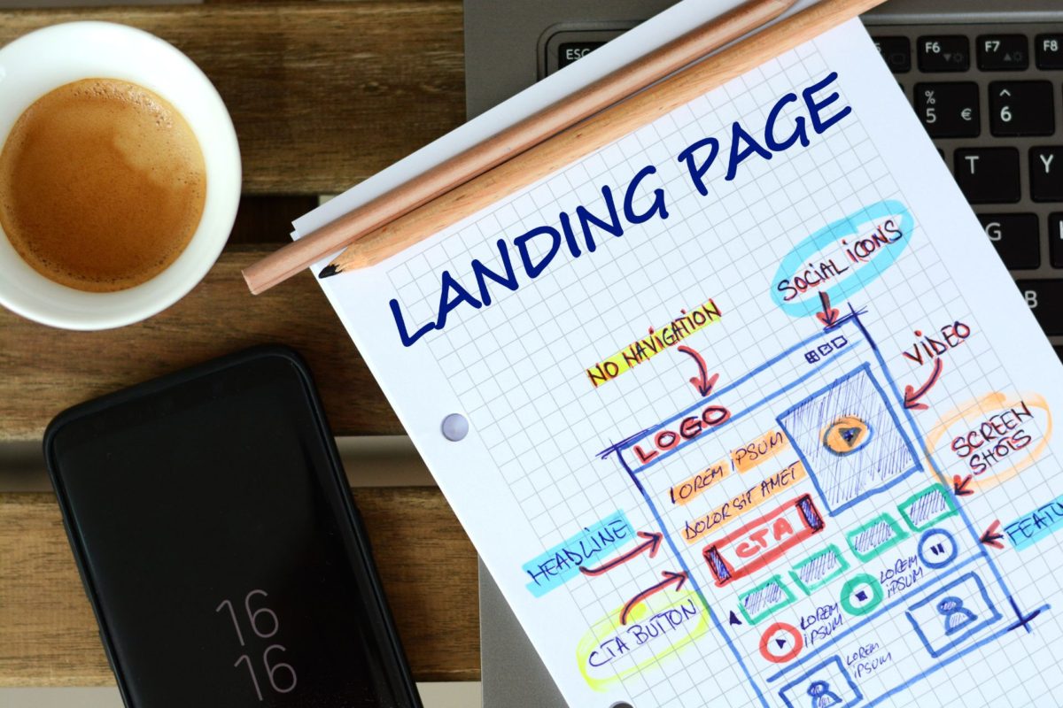
If you want to offer something in exchange for an email address and a newsletter subscription, for example a free discount, it should be worth giving contact information for. That is especially the case when it comes to the things customers buy. You need to think about how to prepare your content. In order to create a high conversion website design you need to take into account elements that encourage the user to perform conversion activities, i.e., the so-called CTA (Call to Action). It can be described as phrases or buttons that encourage customers to quickly make a purchase, click or do something else.
Calls to action should be placed almost everywhere on the website. If we show recipients a fragment of an article or the preview itself, we must encourage them to read the whole thing by clicking the “read more” button. When we want to encourage a purchase or placement of an order, we should use buttons such as “Buy now” or “Order now”. Finally, on the pages where we want customers to contact us, we should use phrases encouraging them to do so, for example “Contact us”, “Send a message” or “Ask us a question”. The CTA buttons should be visible and available at the top of the page, in the area above the fold, immediately after entering it. If the page requires scrolling, you should place the CTA buttons in several places so that they are still visible at the bottom of the page.
Well-crafted CTAs are just one element of an engaging website. If you’d like to explore other elements that captivate your visitors, our article about building engaging website delves deeper into creating an immersive user experience.
3. Make sure your content is consistent with key phrases
Ads often target specific key phrases. If that is your strategy, you must remember that the advertised content on the website must contain them. Ideally, they should be in a visible place for the user – in the headings and in the first paragraphs of texts and descriptions. Content that is consistent with the advertisements will give users confidence that they are in the right place, which will strengthen their trust and encourage them to perform conversion activities. You will achieve the opposite effect if the linked page does not have the phrase used in the ad and the money spent on it will be lost.
4. Use social proof to your advantage
Social proof is a powerful tool to help convince indecisive customers to perform conversion activities. It can be any positive review, an opinion left by customers who bought a product or decided to use one of your services, or showing customers for whom orders have already been carried out, using company logos or links to their websites.
Landing pages can also use rating systems, trust icons, testimonials or even case studies. Appropriate social proof can mean the difference between completed conversions and abandoned ones. Many buyers check opinions before ordering a product or service and make a purchase only after seeing positive reviews. That is why it is also worth giving users the opportunity to leave a comment, but without forcing them to do so. There is no need to be afraid of bad opinions. Contrary to appearances, they make the overall assessment of the company seem more authentic. It has been proven that after reading a negative opinion, users stay several times longer on the website and finalize conversion.
5. Ensure that the page loads as quickly as possible
People hate wasting time. This is true for everyone, even for you. We all get nervous when the page we want to visit loads too slow. Research has shown that up to 40% of users expect a page to load in just two seconds. Only one second of delay can reduce conversions by up to 7%. Everyone wants to have a website design that converts well, and the basis for increasing the efficiency and loading speed is the simplification of its structure. Do not use too many elements, and above all ads, banners or sliders, which can significantly extend the loading time. However, the simplicity of the website itself is not enough. You need to check the loading speed regularly. The website must be designed so that it does not run slowly when there are many users accessing it at the same time. Such situations often occur on websites where, for example, the sale of tickets for an event is launched. This is especially the case when it comes to the official government sites, which are often badly designed – sometimes even websites used for paying taxes are hard to access during peak hours. Do not make that mistake if you do not want to irritate your customers.
6. Take care of SEO
The best website design for conversion is one done by someone who knows that traffic is the most important thing. One of the ways to attract users to the website is, of course, SEO, i.e., positioning in the search engine. All content on the page should be SEO optimized, including landing pages and business one pagers where visitors can perform conversion activities. When searching for information, people mainly pay attention to the results highest in the results. People rarely go to the second result page, unless they do not find what they are looking for on the first one.
If you want to optimize your website for SEO, remember that it is not only about keywords in the content and page activities. It involves activities outside the website, including link building. Collaborating with other sites where you can post content that links to a convertible page is definitely worth the hustle. SEO friendly sites are better rated by the search engine and placed higher in the ranking and search results. This makes it easier to find them, which increases the traffic, and hence the number of conversions.
7. Mobile-friendliness and responsive web design
Almost everyone today uses the Internet on smartphones or tablets. These devices have much smaller displays than laptops. This means that websites look different on them.
Responsive Web Design is the most optimal way to deliver positive experiences to mobile users. RWD is about creating pages that are displayed correctly on all devices, adapting them to their screen size. If the mobile version of the website is easy to navigate and provides a positive user experience, the chances of conversion increase. Responsive Web Design has a positive impact on conversion rates on mobile devices.
The smaller screen will display less content, so you need to create a high conversion website design for easier use and conversion for mobile devices. Contacting, placing an order or making a purchase must also be possible on a smartphone or tablet and must be as easy as on a laptop. Fortunately, even on a laptop, we can see page previews for mobile devices. What should a website optimized for smartphone conversions look like? First of all, the CTA buttons should be visible immediately, without unnecessary scrolling down the page or going through multiple subpages. Remember that in the case of mobile Internet, there are data limits imposed by operators, and therefore it should be possible to perform conversion activities immediately because loading subsequent subpages takes more data. It is worth noting that Google also has a mobile-first index, which places mobile-friendly websites higher in the ranking.
8. Provide various purchasing options
If the website will be oriented on selling products, it is important to offer a variety of payment or delivery options. People are more likely to buy something if they have a choice and can pick a solution that suits their needs. For example, offering only card payment forces the user to enter the payment card details and many clients might be reluctant to do it. You should include other options as well, such as bank transfer, BLIK or payment from an Internet wallet. The same principles apply to the delivery.
Users usually choose the method of delivery not only based on their ability to collect the parcel, but also the costs. Courier delivery is usually much more expensive than delivering it to a parcel locker or to a pickup point. It is worth giving customers a choice in this matter as well. Maybe someone does not have any pickup point near the house, but has a parcel locker? Such a person will not make a purchase when he notices that there is no delivery option that best suits their needs. It is also worth proposing different variants of a given product, for example different sizes and colors – all this influences the decisions of users.
9. Develop and test various solutions
The trial and error method is most often used when you need to make a decision when picking a specific variant of something. When it comes to websites, it is best to create different designs and just test them. For this purpose, you can use the so-called A/B tests. It is a simple method of comparing one project against the other and deciding which one is better. This way you can find out which solution will bring the best results.
However, it must be remembered that tests cannot be carried out overnight, just as you will not get a lot of conversions on a newly created page. You need to spend a lot of time on this task. Do not limit testing to one week per variant. This will not be enough. It takes at least several weeks, if not months, of observing one variant in order to obtain reliable results. If you do not have the appropriate knowledge, it is better to hire a specialist who knows how to use web design best practices to improve the conversion rate. Nopio offers custom website design and user experience design services. However, before you order any of them, think carefully about your expectations, preferences and ideas to write an appropriate RFP website design.
10. Check your website statistics regularly
Statistics are the most important for website owners, especially when it comes to online stores. Web design and conversion rates are inseparable, with the former affecting the latter. You need to know what percentage of people finish conversion activities in order to assess the efficiency of your website and used advertisements. You can also track the conversions themselves, customer behavior on the website as well as where users come to the website from – whether from a search engine, advertising or other traffic sources. A very important indicator for pages created for conversions, and above all for online stores, is the bounce rate. If it is high, something has been done incorrectly and people entering the site quickly leave it. Problems can be found and resolved by carefully analyzing visitors’ behavior on the site. It is a good idea to look closely at all the statistics to know what suits your customers’ needs and what does not in order to give them what they want, expect and require.
There are many tools available for tracking website statistics. These are primarily Google tools – Google Analytics or Google Search Console. In the case of websites made in WordPress, you can also track statistics using dedicated plugins.
To lay a strong foundation for your website’s success, make sure to check out our guide on a website outline before implementing these conversion-boosting design tips.
Finally, it is worth remembering to keep contact with customers. Various forms of interaction are always appreciated. You should answer their questions and doubts and ask them about their opinions about the website and purchase process. Let them express their feelings and rate the website – this way you will know what should be improved. It should also be remembered that website optimization never ends – you have to make changes all the time because the Internet and marketing are both very dynamic. In fact, it is necessary to constantly check, test, control what is happening on the page and update it regularly in order to reach new potential customers.


